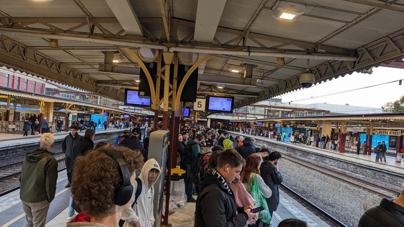
Regular readers of this blog will know that one of my hobby horses is transport wayfinding and communications. This week unfortunately provided yet more examples of how far we still have to go before we have a consistent, intuitive and accurate information system for public transport in Melbourne.
In the space of just the past seven days we have had:
- Platform screens at Melbourne’s second-busiest station become almost unreadable
- The API for the entire state’s real-time public transport information break
- A complete meltdown of the rail network’s station data and displays
It really makes you wonder what’s coming next.
We have countless prior examples of the issues that we face in public transport wayfinding and communication in Victoria. There are a lot of good things and still others that are improving. But as this week has shown there is a lot more that needs to be fixed.
You can have the world’s best public transport – trains every minute, free trams and buses running everywhere – but none of that matters if people don’t know about it. That is why good communications and marketing is just as important as the actual network.

Passengers, especially occasional users, can be seriously put off by just one poor experience. For example, getting lost in a station or boarding the wrong train because of an incorrect or unclear sign. This then snowballs as they will often actively discourage other people form using it with their ‘horror story’ which either cements existing views about public transport or creates new (negative) ones.
Compared to building new infrastructure, getting these things right is cheap, easy and uncontroversial. There are mountains of good examples and case studies from even right here in Victoria that are ready to use and roll out.
I obviously can’t go through every single issue in this one post. But unfortunately this week is yet another illustration of the work that needs to be done to get us closer to a legible and intuitive public transport system.


Leave a Reply