

Recently I presented this project at Transport Camp Melbourne 2024. This post is a version of that as well as more information and background data. There is a link to the presentation and code at the bottom of this article.
Frequency of public transport is one of the most important determiners of its usefulness. It consistently shows up as the most important determiner for public transport use in theoretical and practical studies. Generally all other factors are secondary when it comes to why people use or don’t use public transport.
This is summarised in the slogan used for many years by transport planner Jarrett Walker: “frequency is freedom“.
So the aim of my research project was to work out how many Melburnians live within walking distance of frequent public transport.
Similar studies have been done before. These include Scheurer & Woodcock (2018), Currie & Senbergs (2007) and Curtis & Scheurer (2016). My project provides a different methodology, a local result to Melbourne and more updated data.
What is ‘frequent’ service?
There is surprisingly little agreement on what constitutes a ‘frequent’ service.
Prior to doing this research, I believed that this was defined as a ‘turn up and go’ service of every 10 minutes or better. But it seems that there are many definitions out there, as you can see in the table below.
| Definition of minimum service for “high frequency” public transport | Source |
|---|---|
| Every 10 minutes from 0700 to 1900 on weekdays | (Victorian Department of Transport 2021) |
| Every 10 minutes | (Australian Transport Assessment and Planning Guidelines 2021) |
| Every 15 minutes from 0800 to 1800 | (Bast and Storandt November 2014) |
| Every 20 minutes during weekday interpeak | (Brown et al. 2019) |
| Every 15 minutes from 0700 to 1900 on weekdays Every 15 minutes from 0800 to 1900 on Saturdays Every 15 minutes from 0900 to 1900 on Sundays | (Transperth 2022) |
| Every 15 minutes on weekdays | (Translink 2022) |
For my research I defined ‘frequent’ service more or less in alignment with the Transperth definition, but bumped up from every 15 to 10 minutes.
Generally these definitions align with those used by Infrastructure Victoria together with Infrastructure Australia and Curtis et al. (2016). This defines AM Peak as being from 0700 to 0900, Interpeak as 0900 to 1600, and PM peak as 1600 to 1800. Other time periods and names have been based on the Australian Transport Assessment and Planning Tool.
Parameters
Before starting on the method I defined the other definitions needed to complete the analysis.
Melbourne is defined as the Greater Melbourne Greater Capital City Statistical Area statistical boundary used by the Australian Bureau of Statistics.
Walking distance is defined as an 800 metre distance along walkable routes at a 5km/h walking speed. Both of these measurements come from standard practice used by the Victorian Government in land use and transport planning.
Data and tools
To pull this all together I had two sources of data and four tools, all free and open source.
For public transport service information I used the General Transit Feed Specification (GTFS) published by Public Transport Victoria (PTV). This is an incredibly useful dataset that includes public transport routes, timetables, stops, etc. in a standard format used across the world.
The background maps and data on walking routes came from OpenStreetMap, a free and open source map of the world. It’s one of my all time favourite things and I’ve been a regular contributor for almost a decade.
I obtained population data from Meshblocks. These are the smallest statistical boundary used by the Australian Bureau of Statistics, containing about 30 to 60 dwellings each.
Finally, to run the analysis and produce the results themselves, I used the following tools:
| Name | Description | Link |
|---|---|---|
| GTFS Functions | An open source Python script that is used for preparation and analysis of GTFS data. Due to an upgrade of the ‘pendulum’ Python package breaking a dependency in this script, which is used to read dates, an older version (2.1.2) was used. | https://github.com/Bondify/gtfs_functions |
| QGIS | A free and open source Geographical Information Systems (GIS) software used for a geospatial data display and analysis. | https://qgis.org |
| Overpass Turbo | A free and open source tool to extract data from OpenStreetMap. | https://overpass-turbo.eu/ |
| OSMnx | A free and open source Python package to download, model, analyse, and visualise street networks and other geospatial features from OpenStreetMap. | https://osmnx.readthedocs.io/en/stable/ |
Method
Put simply, my method was as follows:
- Gather PT service data & extract relevant information
- Overlay onto ABS Meshblocks
- Prepare and load walking network
- Run analysis
- Map results
For those who are interested I have uploaded the full method, including the code and filters used, to this Github repository here.
Results
The total results are summarised in the table below:
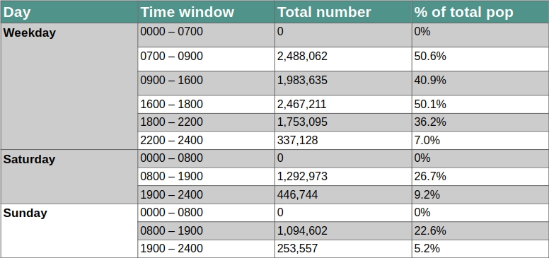
The main headline findings are:
- At its best, just over half of people in Melbourne live within 800 metre walking distance of a frequent public transport service
- Evenings on weekends in particular have very low levels of frequent service
- On weekends during the day only around a quarter of people in Melbourne live within 800 metre walking distance of a frequent public transport service
Here are some maps that show the spatial distribution of service at different times.
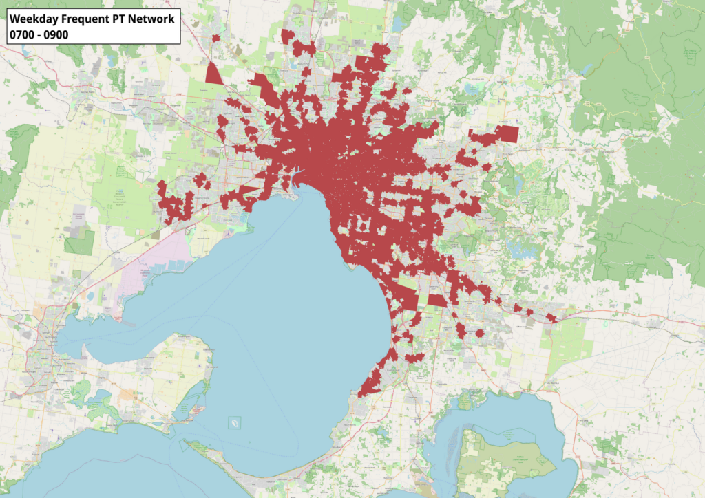
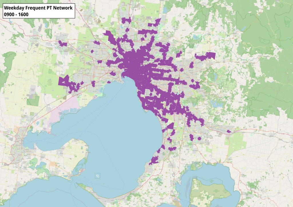
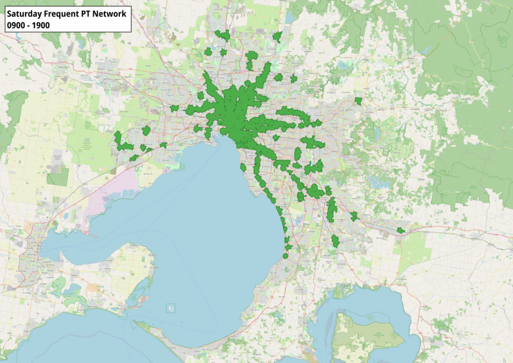
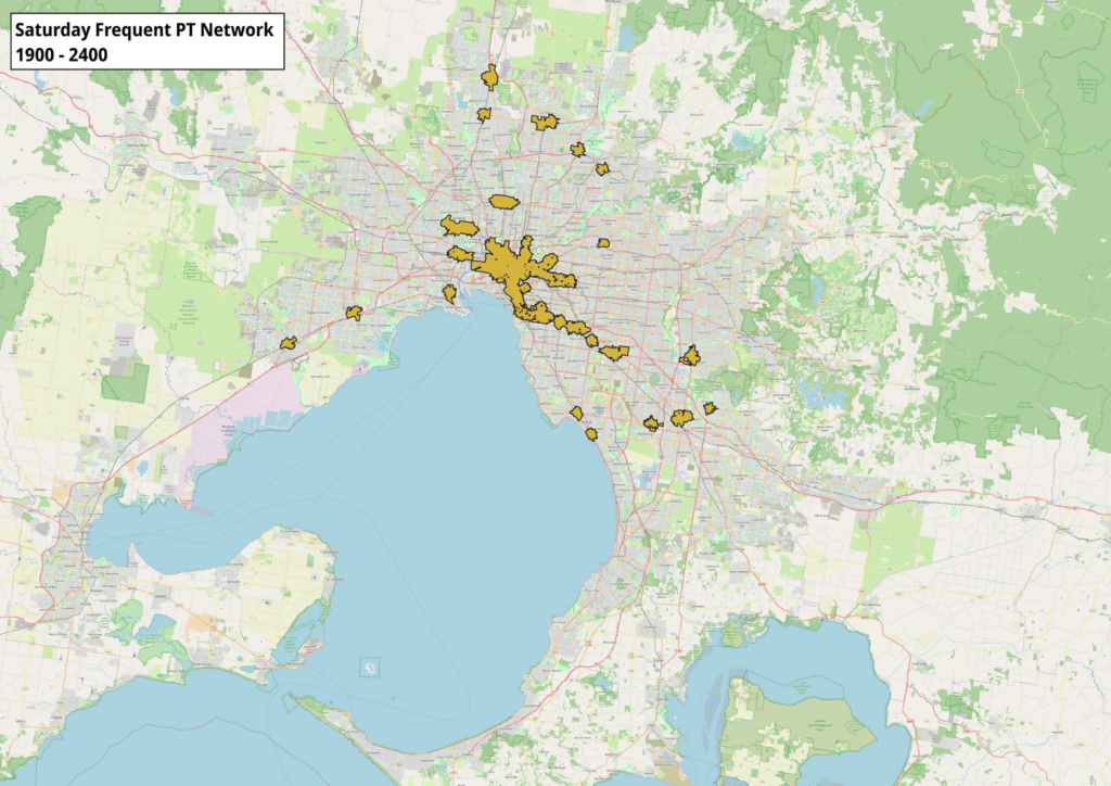
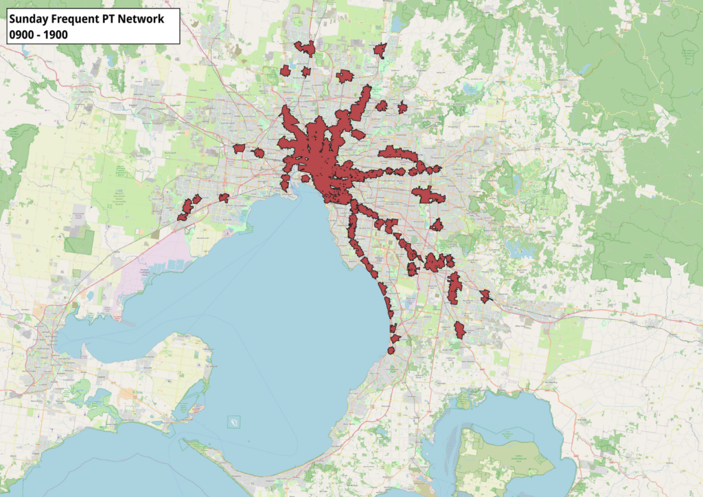
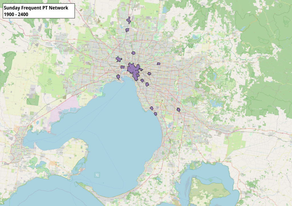
Note that even this low coverage is an overestimate. This is mainly because many of the single polygons shown are bus or railway station interchanges with routes heading in different directions. This means that while technically there are services departing every 10 minutes or more in that specific spot, it is not representative of a frequent service in any single direction. For example, a polygon would show up in this analysis if there were six bus routes running hourly to the same interchange – not really a frequent service.
Limitations
PTV GTFS
This process was initially attempted using the official Department of Transport & Planning (DTP) GTFS files. However, these files rendered incorrect frequency information for several routes. This seems to have been caused by duplicate or even triplicate routes being present in the routes.txt file.
The reason for this appears to be caused by ‘combined’ routes with common corridors being listed in the GTFS data in addition to the individual routes. This results in the same services being listed multiple times. This had the effect of vastly overstating frequencies across the metropolitan bus network and was not present in other mode datasets.
When I discovered this anomaly, I performed several GTFS validation checks to check the integrity of the data. This showed 113,674 notices, including 13,071 errors. These included duplicate route names, inconsistent or incorrect GPS coordinates and stops being out of date.
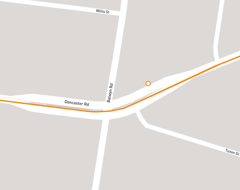
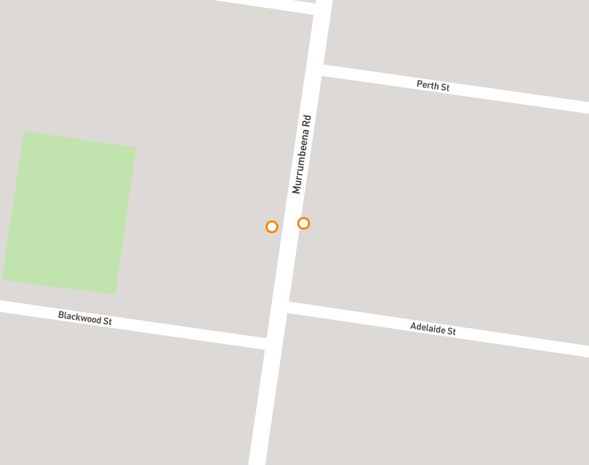
Bus stop points are also not shown consistently. Some stops have a single point for services operating in both directions while others are separate. There does not appear to be any consistency. See below for one example of each.
Population catchment
While mesh blocks are small geographic areas, they are often only partly covered within the specified walking distance from a frequent public transport stop. This means that the results of this research likely overestimate the number of people within this distance.
Walking speed
The average walking speed of a pedestrian used in transport planning and engineering is only a guide. The actual walking speed of a person can vary significantly depending on a variety of factors. These include personal attributes such as age, but can also include other variables such as weather, quality of infrastructure and purpose of trip.
‘Lumpy’ timetables
The definition of a ‘frequent service’ for the purposes of this paper does include some short sections of overlapping routes that may quality under this definition but to not provide reliable 10 minute or better headways. This may be due to an uneven or uncoordinated timetable that technically provides six trips per hour but not at equal intervals.
Disruptions
Melbourne’s public transport system is subject to frequent and significant disruptions. There was no week-long period without any planned disruptions to the train or tram network for all of 2023. The time period selected for this analysis contains minimal disruptions but is as recent as possible to account for infrastructure changes, such as new station locations constructed as part of the Level Crossing Removal Project. The dates selected, while generally free of disruptions except for three: Parkdale Station closure, Narre Warren Station closure and Route 788 summer timetable operation. There were easily filtered out or did not affect the results.
Night Network
Night Network services that only operate on Saturday and Sunday nights are excluded. However, this has minimal impact on this analysis given the low headways of 60 minutes.
Conclusion and further research
This was a very interesting learning experience for me. I am not a coder and not trained in Python, R or other programming languages. Doing this research helped me learn a little bit about these and other tools and how they can best be used in transport planning.
As always I am indebted to the many people who build, support and contribute to the amazing suite of free and open source software and data that make things like this possible. Please check them out and support them if you can.
There are many opportunities for further similar research if anyone is interested. In particular, it would be interesting to see the results of this method applied to non-residential uses, controlling for the ‘lumpy’ timetables limitation that I outlined earlier and testing the impact of different walking speeds on service access.
Leave a Reply