
Despite some recent changes, I think there is still a lot of work to be done to improve the quality and accessibility of rail disruption information in Melbourne.
Consider the main ‘Disruptions’ page on the PTV website, accessible here: https://www.ptv.vic.gov.au/disruptions/disruptions-information/

If you are a passenger looking at this screen, you might thing that all is going pretty well. There is a mix of green and yellow dots but nothing that looks too serious.
It’s not until you click on an individual line that a little popup box tells you ‘Buses replace trains in October 2020’.
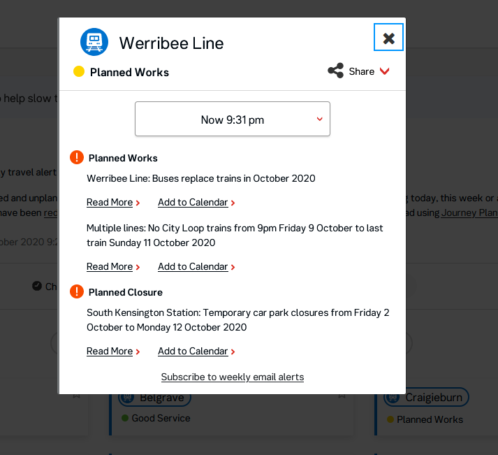
As you can see, the shutdown of an entire railway line for several days apparently falls under the same category of importance as a couple of carparking spaces closed at South Kensington. This seems odd when you compare the level and scale of each disruption. One impacts, at worst, a few dozen people, while the other is a series of days where an entire railway line with tens of thousands of passengers is shut down completely.
Once you click on ‘read more’, the disruptions page is long, confusing and doesn’t communicate key information well.

Almost all the information in displayed as a huge wall of text without any navigation assistance beyond simple bold text as headings (which aren’t even built as internal page links).
The first sentence on the page offers little information on what “project and maintenance works” are. Many other transport networks provide more detail on what is happening which helps to reduce confusion and improve understanding amongst the travelling public. Fewer irate passengers is a good thing for everyone and more (well-presented) information tends to help.
But this is a minor sidenote compared to the issues on the rest of this page.
The links to the replacement bus frequency in the table send passengers to a separate webpage on the Metro Trains website. This is a small improvement on the old multi-page PDFs but it is not an easy page to understand.
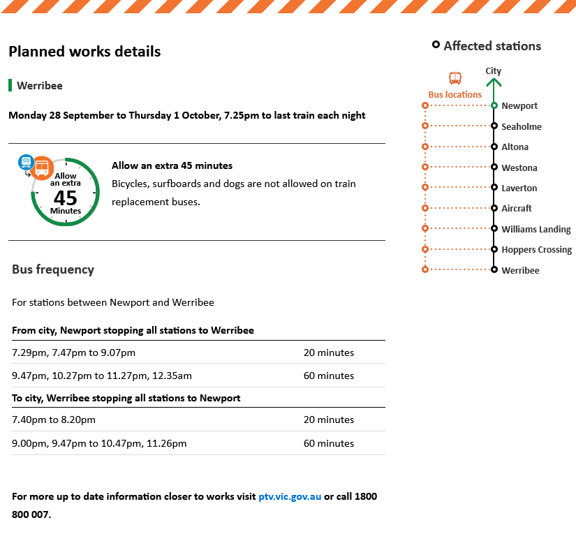
The most important thing to note here is that this page does not explicitly state anywhere that buses are replacing trains. It may seem obvious after reading the previous few paragraphs, but having ‘Planned works details’ as the largest text on the page is not the clearest way to convey what is arguably the main thing that people need to know.
Moreover, just having a vague ‘bus frequency’ as the alternative transport information is not very useful – especially for such large gaps between services. What passengers need to know in relation to the service is:
- When do I need to be at the station to catch the bus? Will it be the same time as my regular train?
- Will a bus wait for a train at Newport or will it depart at a specific time?
- Will trains continue from Newport to Flinders Street?
None of these questions are answered clearly (or at all) on this page.
Finally, if you hover over the station names on this page you can see where the bus stops are located. This is definitely an improvement on the lengthy attempts to describe their locations by PTV using text, but we’ll get to that later.

My main issue here is that you don’t know that these maps exist unless you happen to move your cursor over the station names on the right. Otherwise you have to rely on the PTV disruptions page, which we will return to now.
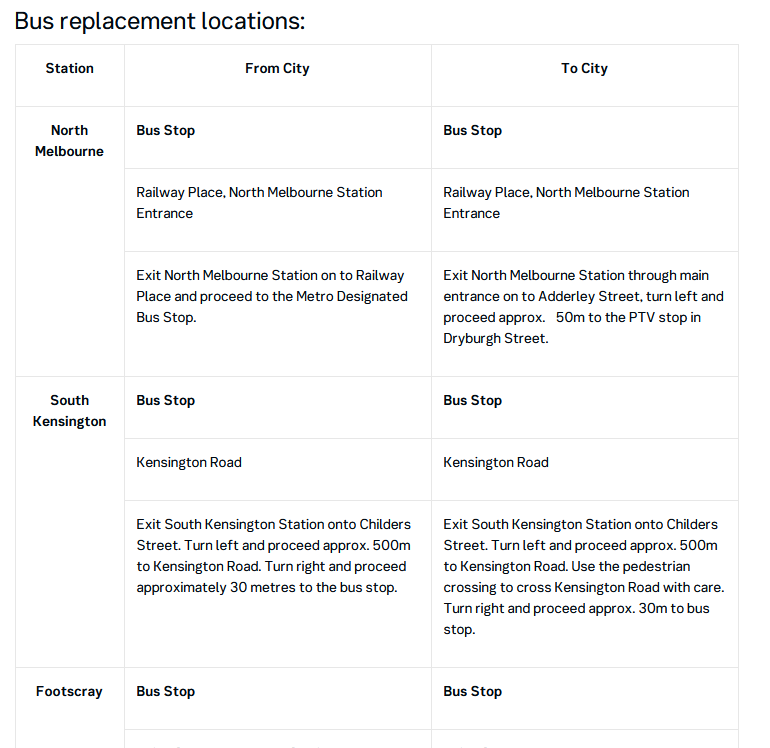
The last but longest section on the PTV page is a long table giving a detailed description of the locations of every bus replacement stop at each station. This can be handy if the maps aren’t working, for people using screenreaders or if the stops are hard to find. But it does take up an awful lot of space. More importantly, this is the information that is put in front of passengers first rather than any visual graphics which would explain this much more quickly and easily in a smaller format.
None of this is helped by the poor formatting of the page, which relies on a single column of HTML content. There are many more efficient ways to organise information on webpages and we should be utilising these to arrange information in a clearer way.
Finally, just to add to the confusion, there is one disruption in the list on this page which does not link to the Metro Trains website as we saw above with all the others (the one called ‘Newport and Werribee, 7.25pm to last train each night‘). Instead, this one disruption has its own PTV page which contains all the bus replacement information in a different format. This page is even more vague, explaining that the disruption is happening due to “works”.

It’s unclear to me why this particular disruption is treated differently to all the others in this list.
So how can we make this better?
Coming up with a decent system would be quite easy. Every public transport system has some sort of online presence and there are plenty of good examples to get ideas.
If anyone from PTV is looking for some inspiration, London’s disruptions page below makes a lot more sense (accessible here: https://tfl.gov.uk/tube-dlr-overground/status/)

The first thing to notice is the map on the right. Not only is it interactive, but it displays all the disruptions listed on the left visually – depending on the time and day selected. This makes it much easier for people to understand what’s happening – and, importantly, to work out alternative travel options.
The second important thing here is the categories. ‘Planned closure’ is a separate category in itself, as is ‘part closure’. Disruptions like carpark closures, bins falling over or other lower-order issues are kept to each station rather than sending out constant alerts across the entire line at a level equal to bus replacements.
Finally, if you click on a disruption, it gives you viable alternative transport options and a direct link to the journey planner if these don’t work. This only seems to happen haphazardly in Melbourne, and usually only on Twitter when there are major disruptions. This normally results in vague or impractical advice being disseminated. Even for a rail line shutdown, there is little information for any alternative public transport other than bus replacements (even though other options exist and would likely get many people to where they need more quickly).
What do we learn from all this?
Keep in mind that during a disruption, passengers need to know four key pieces of information:
- What is happening (and why)?
- How am I affected?
- How can I get where I need in the quickest and easiest way possible?
- Where can I find more information?
All of this needs to be communicated with the minimum amount of space and time. The best examples of this communication show that graphics trump walls of text (although you always need text as well to account for accessibility). Detail is important but should not be the first thing that you put in front of people. You need a quick summary from which you can glean the important information in under 15-20 seconds.
As I’ve said above, the current situation is an improvement on at least the recent past. Social media, high market penetration of smartphones and the rapid advancement of mapping technology have all helped. Now we just have to figure out how to make the best use of these tools.
Some further reading on this topic from Monash University: http://publictransportresearchgroup.info/wp-content/uploads/2017/02/PRESENTATION-2016-ARA-Forum-Unplanned-Rail-Disruptions.pdf
Leave a Reply