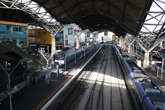
This post continues a series analysing station patronage data for Melbourne and Victoria from 2013 to 2018. This time, we are going to look at patronage growth across the metropolitan area.
Result
Combined with the data already available on the TfV website from 2008, we now have a nine year view of station patronage in Melbourne. Note that there are two data gaps in the 2012-13 and 2014-15 financial years.
Analysing this combined information yielded some surprising results (to me anyway).
These are the top 10 stations with the greatest difference between 2008-09 and 2017-18 patronage:
| Rank | Station | Patronage growth (2008-09 to 2017-18) | Line Group |
|---|---|---|---|
| 1 | Southern Cross | 5,524,710 | Inner City / City Loop |
| 2 | Flinders Street | 3,519,528 | Inner City / City Loop |
| 3 | Richmond | 2,113,555 | Inner City / City Loop |
| 4 | South Yarra | 1,888,078 | Inner City / City Loop |
| 5 | Caulfield | 1,573,269 | Caulfield |
| 6 | Footscray | 1,552,519 | Northern |
| 7 | Melbourne Central | 942,695 | Inner City / City Loop |
| 8 | Box Hill | 635,361 | Burnley |
| 9 | North Melbourne | 612,229 | Northern |
| 10 | Craigieburn | 586,553 | Northern |
Craigieburn stands out in these rankings as a non-inner city location. Its patronage almost doubled from 575,925 in 2008-09 to 1,162,477 in 2017-18. This is almost certainly due to the huge amounts of urban sprawl being constructed in that corridor. Part of this growth may also be due to increases in employment opportunities nearby and interchanges to/from V/Line services on the Seymour Line.

The table above shows absolute passenger numbers. When you look at growth as a percentage over the same period, a very different picture emerges:
| Rank | Station | Patronage growth % (2008-09 to 2017-18) | Line Group |
|---|---|---|---|
| 1 | Officer | 77% | Caulfield |
| 2 | Richmond | 51% | Inner City / City Loop |
| 3 | Craigieburn | 50% | Northern |
| 4 | North Richmond | 49% | Clifton Hill |
| 5 | South Kensington | 49% | Northern |
| 6 | West Footscray | 48% | Northern |
| 7 | North Melbourne | 47% | Inner City / City Loop |
| 8 | West Richmond | 45% | Clifton Hill |
| 9 | Westall | 43% | Caulfield |
| 10 | Jolimont | 43% | Clifton Hill |
Officer is the obvious standout in this table with the largest growth across metropolitan Melbourne by a large margin. As noted in a previous post, the station is located in the heart of the large amounts of growth in the south-east of Melbourne. In 2015, this sub-region made it into the top 10 areas of largest population growth measured by the ABS. As a result, the number of people using this station in 2008-09 was 21,479 compared to 91,956 in 2017-18.
Only Craigieburn, Richmond and North Melbourne make it into both tables. Some of the other seven stations in the top 10 as a percentage are mostly located where significant increases in population have occured over the past decade, such as Officer and North Melbourne.
It is interesting that North Melbourne has retained its growth despite V/Line trains no longer servicing the station after the construction of Regional Rail Link.
Data notes
A usual word of warning on this data – the gate configuration at some stations like South Yarra and Caulfield tend to overestimate patronage due to people having to touch on and off again in order to interchange. It also doesn’t take into account fare evasion, paper tickets, etc.
I have excluded newly-built stations like Williams Landing and Mernda for obvious reasons.
Stony Point Line stations were not included in the 2008-2014 data. This means that they were excluded from this analysis.
A final note that this post took me much longer than usual on account of an annoying anachronism between the two lots of station data. For some reason, the alphabetical order was incorrect for some names in the 2015-18 data. For example, Ringwood and Ringwood East were in different orders on different spreadsheets. This resulted in much more effort than was necessary to amalgamate the data.

Leave a Reply