

One marked improvement to Melbourne’s railway stations over the past few years has been the reintroduction of maps showing the surrounding area. These were once ubiquitous across the network and took many different forms.
The most recent variant before the current one was simply a snippet of a Melway for the local area, like this one at Laburnum.

There are a handful of even older ones still around like at Newport and Williamstown Stations.
There was also a short period around the mid to late 2010s when a new style of map was used at a couple of new stations and even bus interchanges. Unfortunately it didn’t feature a lot of information and had limited utility, but it was at least an attempt to install physical signage in an era where there is immense pressure for everything to be digital.
These maps were never widely implemented. They seem to have mainly been installed at stations rebuilt by the Level Crossing Removal Authority / Project.
One example is this one at Reservoir.

And in some stations, mostly regional, you can also get unofficial maps like this at Drysdale.

I very much welcome the return of physical maps to stops and stations after PTV spent years removing as many as possible. But simply having a map is not helpful – they must also be accurate, usable and useful.
There are many examples around Australia and the world to learn from. Here is one from Villejuif-Louis Aragon Metro Station in Paris.

And another from Bandar Tasik Selatan (BTS) Station in Kuala Lumpur.

The not so good
Let’s start with Hawthorn as an example. Here is a photo of the precinct map at the north-east entrance to Platforms 2/3.

This is a relatively simple area. There are only three platforms, one tram and one bus route nearby (in theory at least), so I wouldn’t expect that many things to be wrong. Unfortunately the list of errors and omissions is very long. Here are the ones that I found (click on the image to enlarge it):
Another one to see is at Ringwood. Unlike Hawthorn this is a major interchange station, not only between trains but onto buses (again you can click on the map to see a larger image).
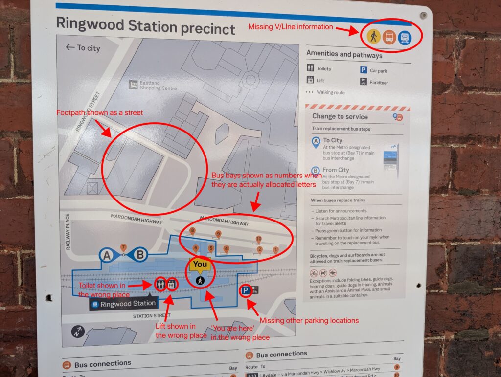
These are far from isolated examples.
Every single one of these precinct maps that I have seen has had at least one error. Some are minor but many are significant and have serious potential to misdirect, mislead or confuse people.
Consistency is also very important. While many of these maps do not show pedestrian paths, others do – like Station Walk here at Brighton Beach Station.

Design
Aside from factual errors and inconsistencies there is also their design and usability.
One example where this is missed is at Footscray. It has a lot of bus connections spread out across many different stops.

Leaving aside the layout of the bus connections list, this map gives no guidance for where to find each route. Some stop right outside the station entrance on Irving Street whereas others are a fair walk to the Paisley Street interchange.
Still others depart from the bus stop on the north side of Irving Street just west of Leeds Street. This also appears to be missing from the map.
There are many stations where this applies and it can be difficult to find the right stop. These maps aren’t necessarily incorrect, they just leave out what I think is essential or at least very important information and make themselves unnecessarily difficult to use.
What next?
We can do better. The few bus interchange maps around are very good for what they do and address many of these issues. For example, they include detailed lift and amenity locations and pedestrian crossings. They are still not perfect though and also need improvement.

As I said I welcome the return of physical maps. I think these should continue to be installed and updated at every railway station, and returned to tram and bus stops too.
But if we are not prepared to at least make them accurate then I would be the first to call for them to be removed. As we’ve discussed before, the only thing worse than missing information is wrong information.
Many of the overseas examples I listed above also have their problems and I am not saying that they are perfect. But we should always learn from the past where things have been tried and tested before, including our own.
Leave a Reply